Take flight with Wings Airlines, an airline that keeps the booking process simple and straightforward. You can be sure to fly on Wings like eagles when you soar the skies with Wings.
This project was done for the UX Design Institute course where we were asked to complete a booking process case study to get hands-on experience with the UX design process.

1. Discover
The Brief
Your client is a start-up airline. They’re looking to create an online experience that is fast, easy and intuitive: one that’s based on a deep understanding of their target users. You are going to design a new website or mobile app for your client. You’ll focus specifically on the flight booking process: how users search for and select flights online.
My role: UX/UI Designer – User Research, Interaction Design, Visual Design, Prototyping, Testing
Note Taking
To begin this process, I observed two user interviews testing two common European airlines, Aer Lingus and Eurowings, and took detailed notes on how the users interacted with the websites. This provided insights into similarities and differences for current airline booking processes.
User Interviews
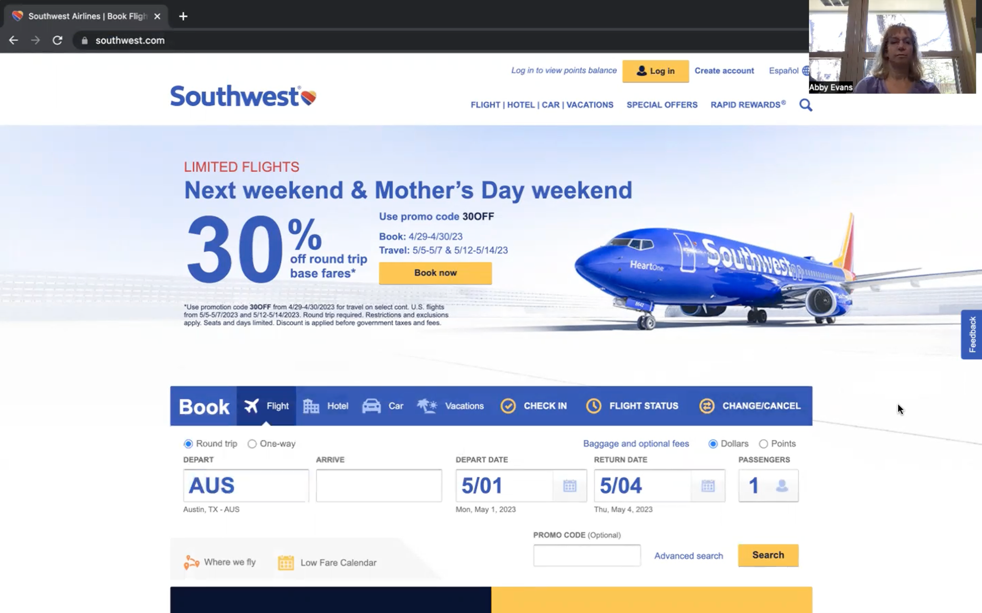
I now completed my own two user interviews where I utilized an interview script and tested two main US airline websites, Southwest Airlines and American Airlines, to observe best practices and potential improvements. These interviews helped inform design decisions and craft an intuitive product.
The first user interview was with a young adult who's very familiar with technology and books several flights a year.
The second user interview was with a middle aged adult who's less familiar with technology and books a few flights a year.
The tasks at hand:
1. Using the American Airlines site, book a round trip flight from Seattle to Phoenix at the end of October, Saturday preferred, with 2 passengers total for 3 nights
2. Using the Southwest Airlines site, book a round trip flight from Seattle to New York at the end of October, Saturday preferred, with 2 passengers total for 3 nights
Click images to watch the full user interviews:

2. Define
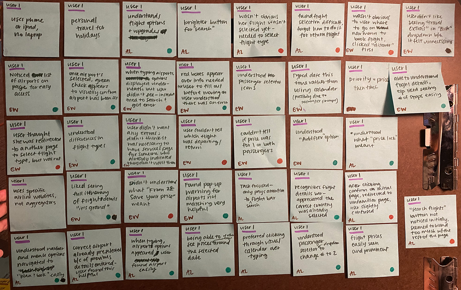
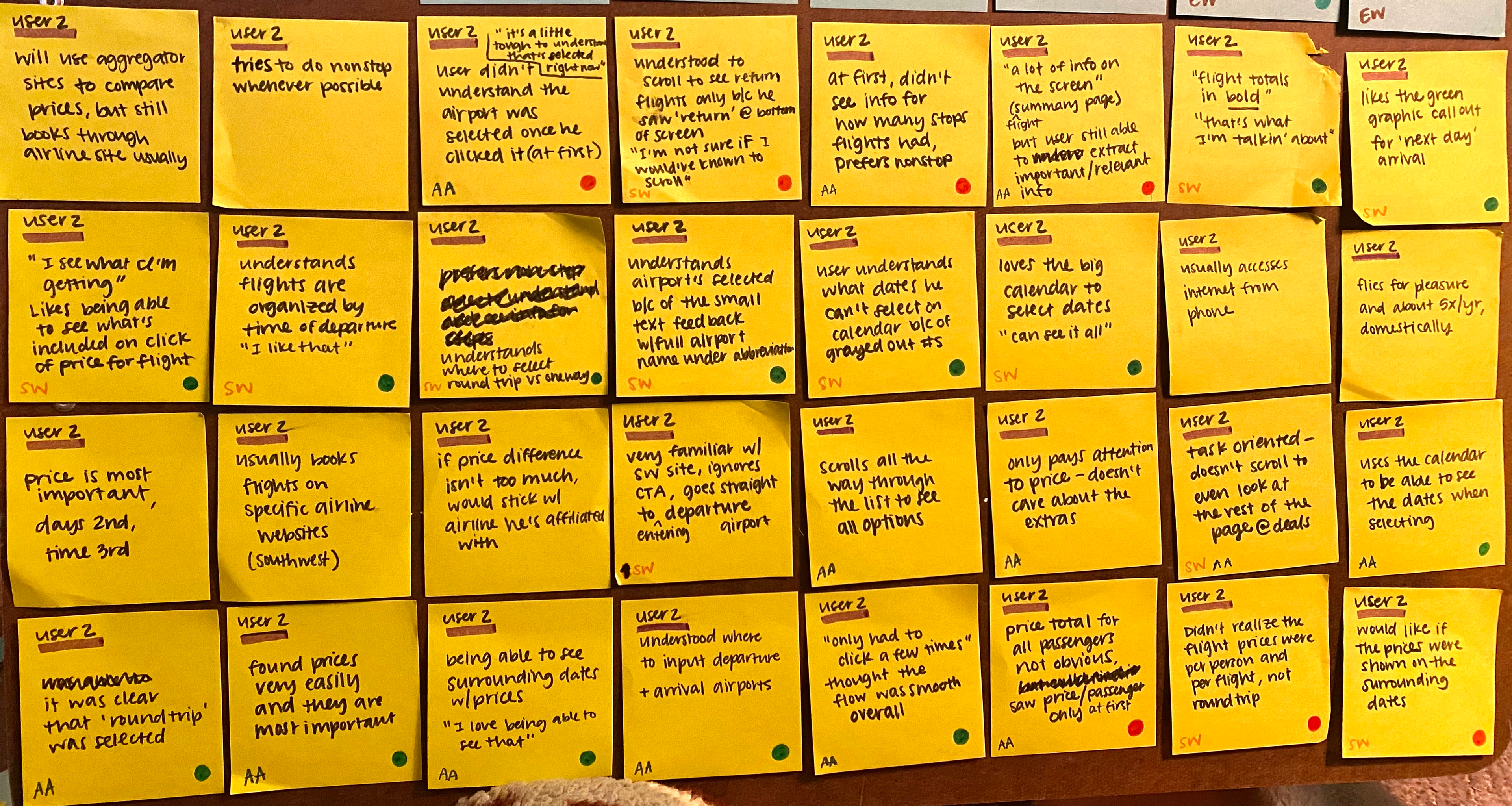
Affinity Diagram
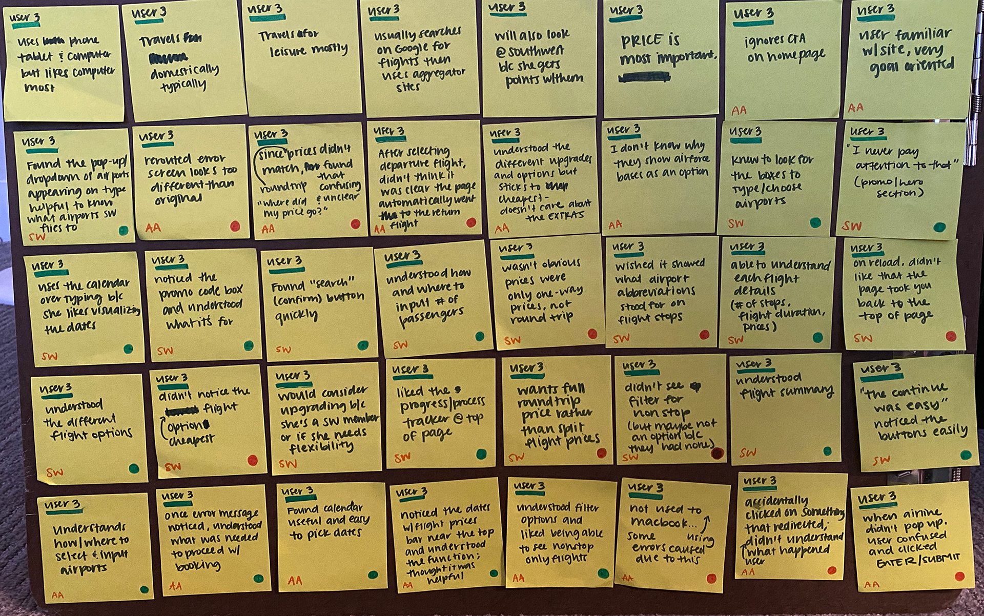
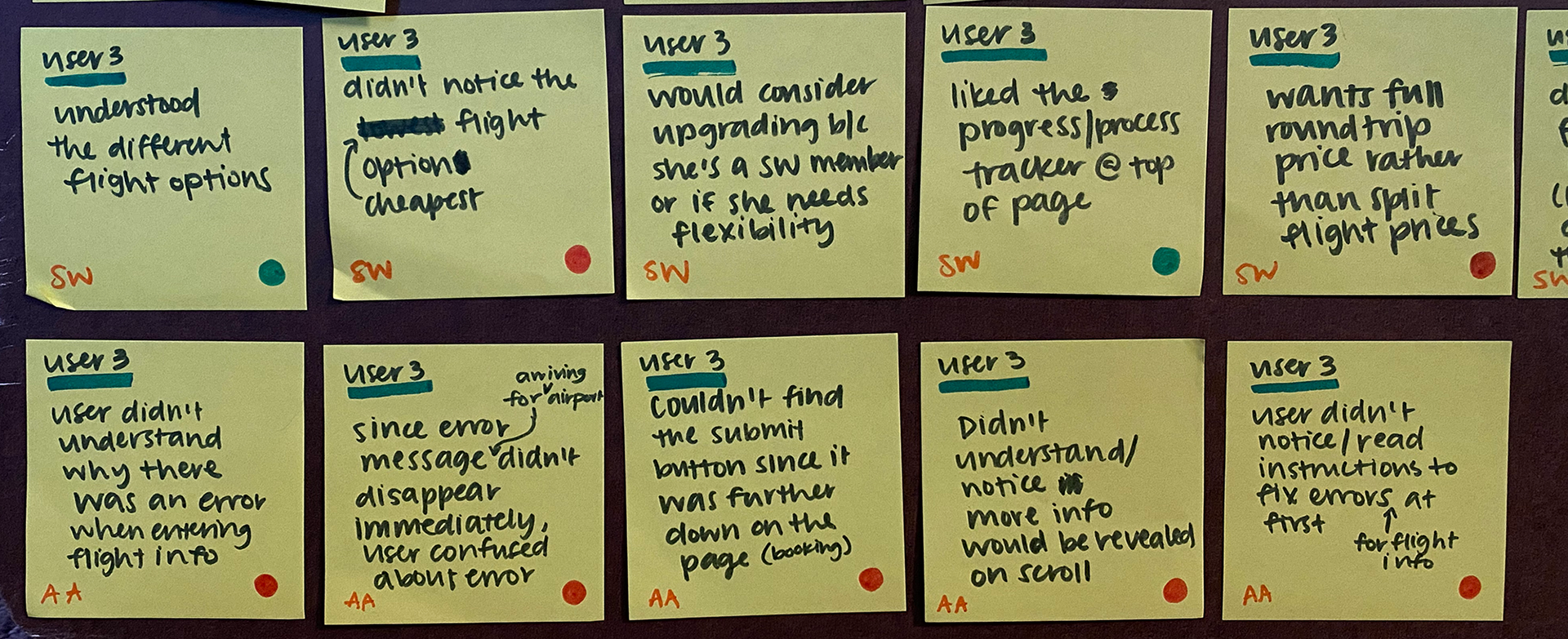
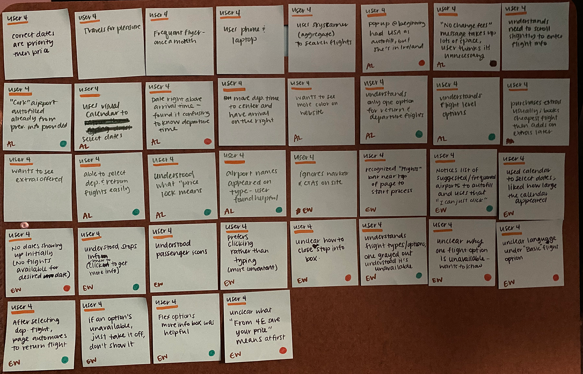
With all of the research done so far, to compile the findings together cohesively, an affinity diagram was created. I used my notes and interviews to write points on Post-Its, coded them with positive experience, pain point and the different airlines, then sorted these into groups and named them (see full affinity diagram for sorting).
All Post-Its
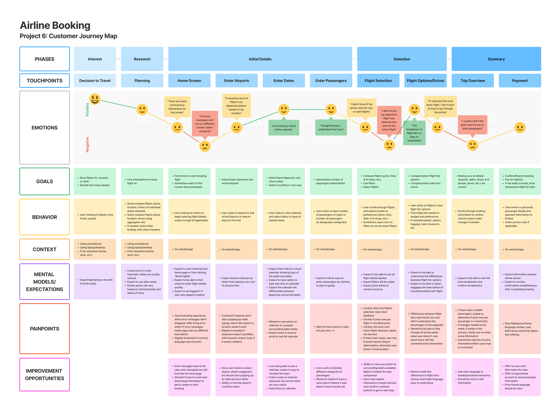
Customer Journey Map
Now, I structured this data into a customer journey map to further empathize and understand the perspective of someone going through the booking process. At this step, there was more clarity on improvement opportunities as well as non-negotiable elements that matched user's mental models.
Some improvements noted were:
- Users don't want to have to scroll past distracting information to get to where to start booking–only include what's necessary.
- The option to type the date as well as have a visual calendar appear when picking dates is very useful and prevents users from inputting incorrect dates.
- When looking at flights, the ability to view and switch to surrounding date’s available flights is helpful for easy comparison.
- There needs to be clear distinction between flight tiers with the use of basic, easy to understand language.
- The trip summary and price breakdown should be digestible and easy to edit if needed.
(Click image to fully view journey map)
3. Design
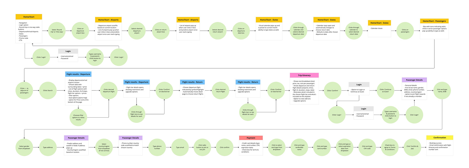
Flow Diagram
Before getting into the layout of the pages, to better understand how the airline booking process would go, a flow diagram was created.
(Click image to fully view flow diagram)
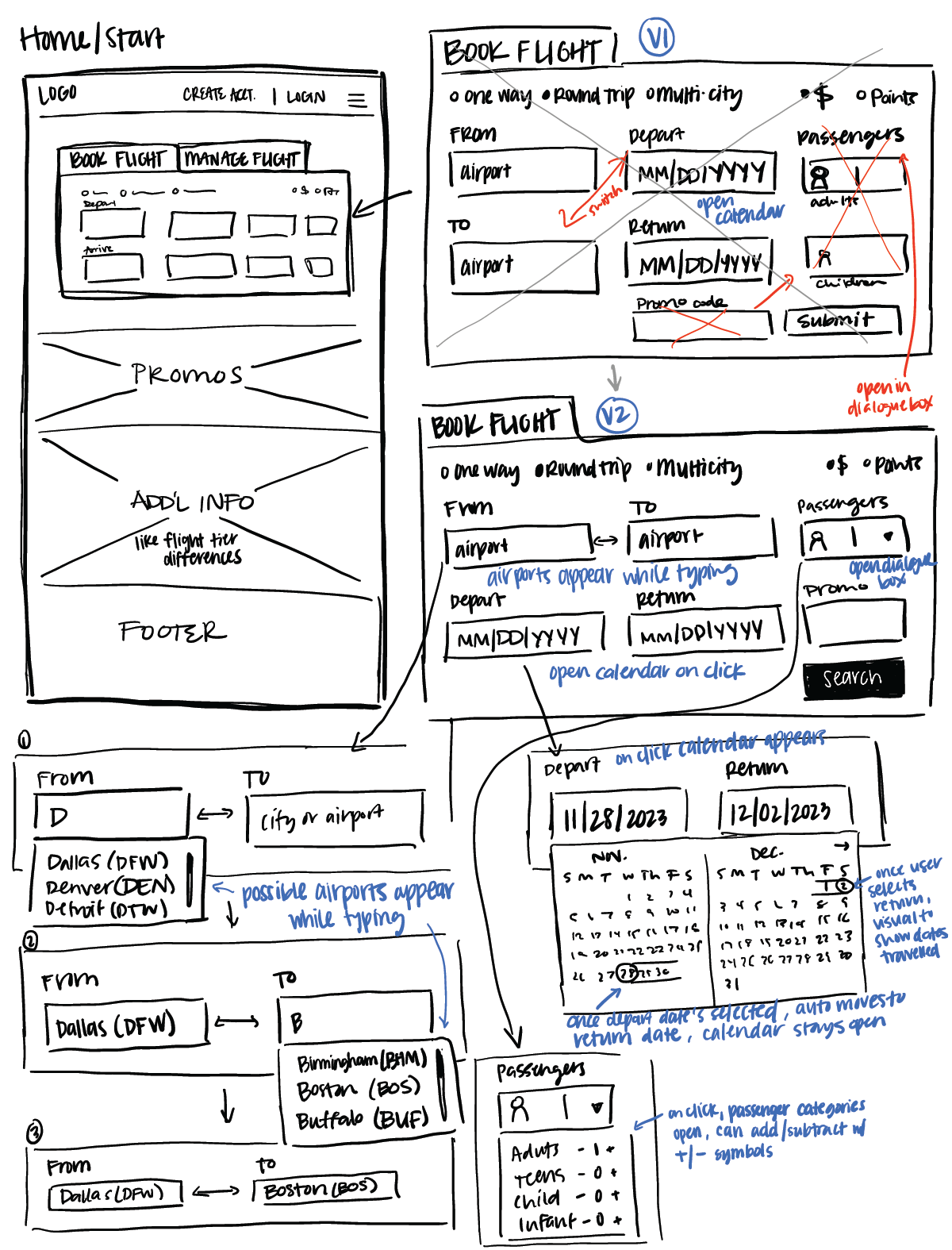
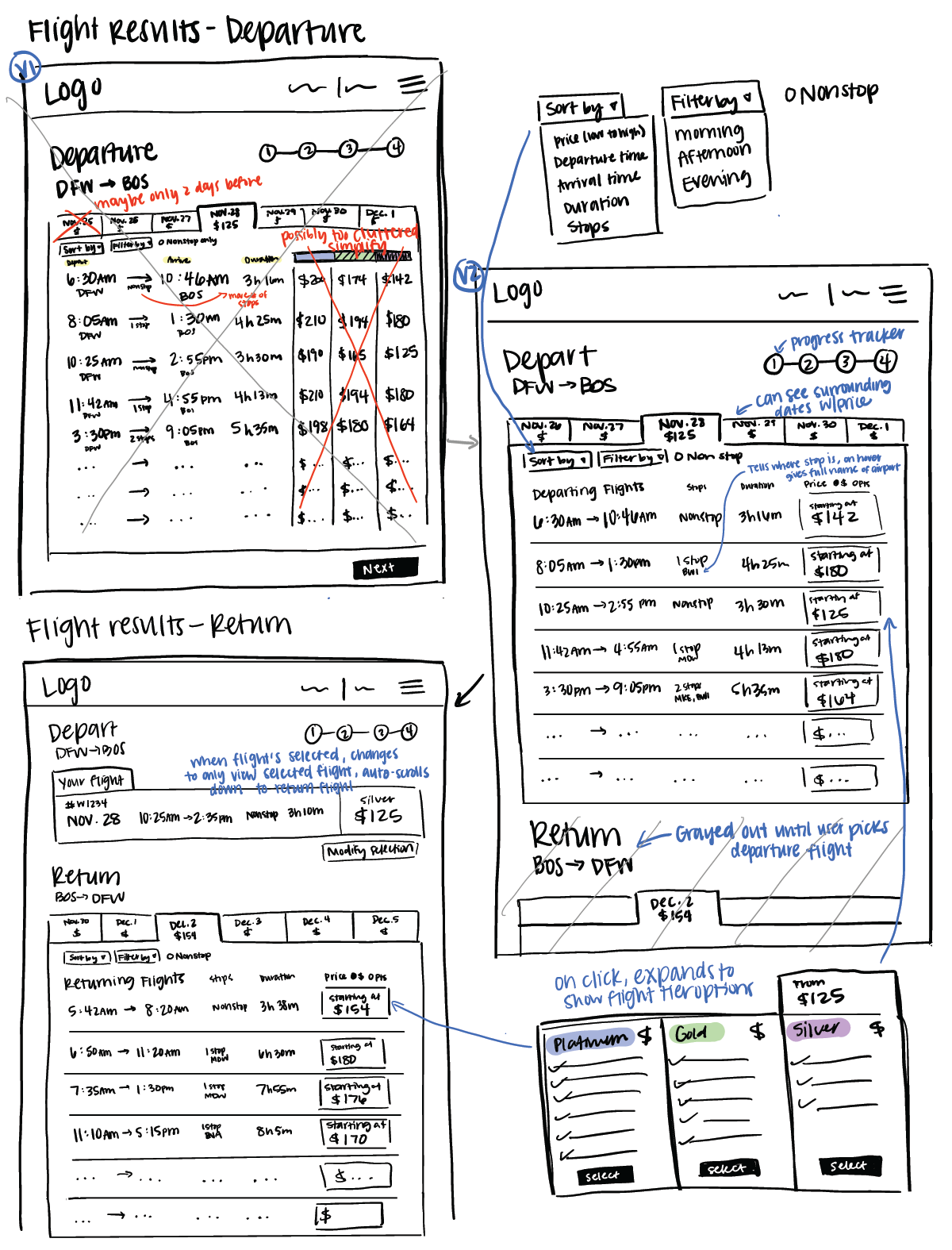
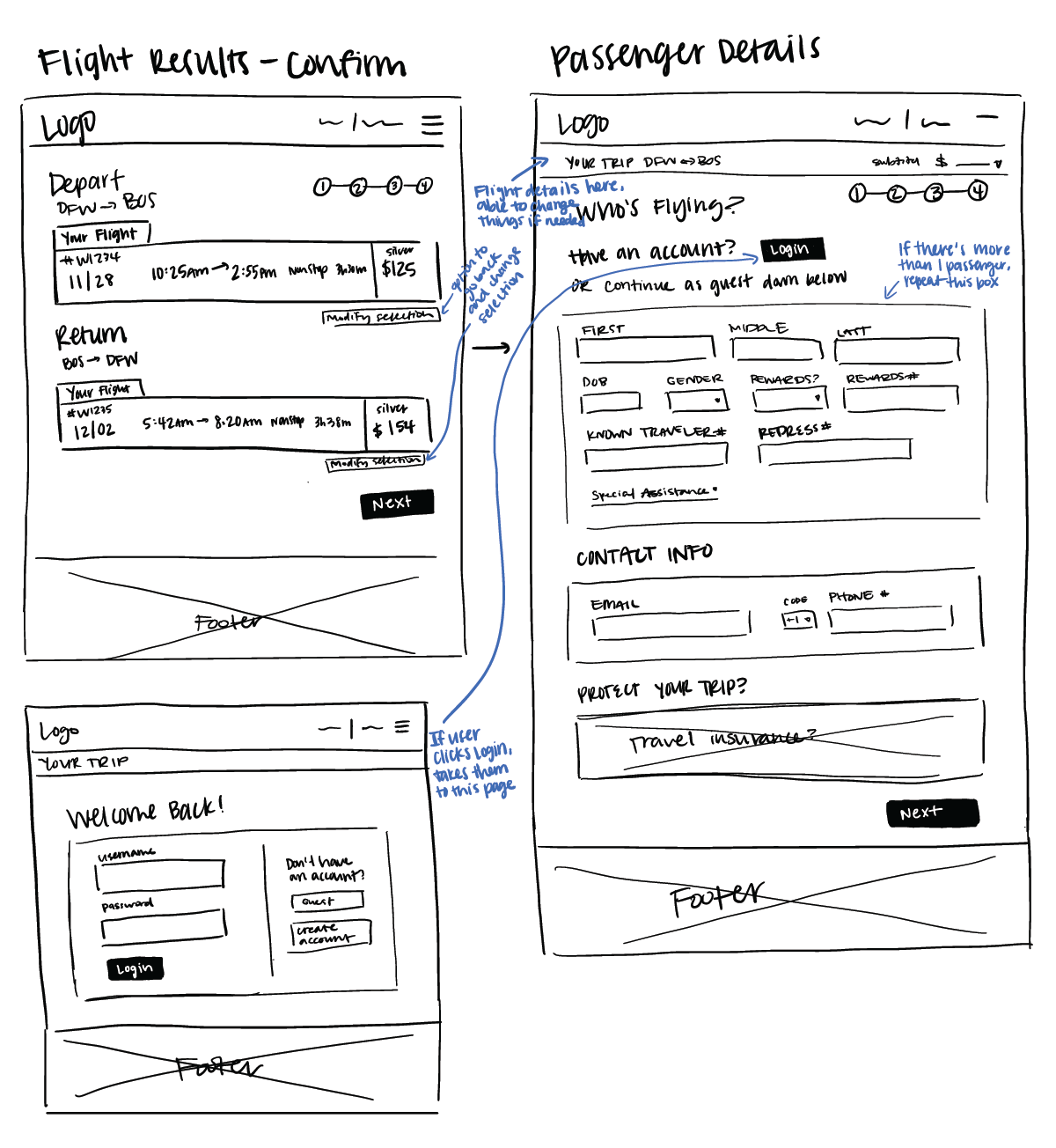
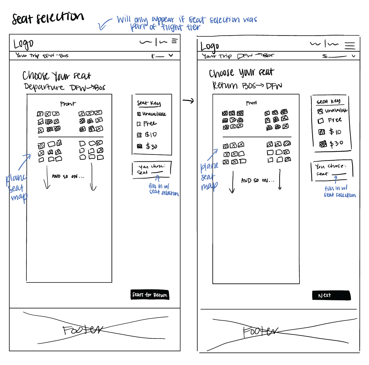
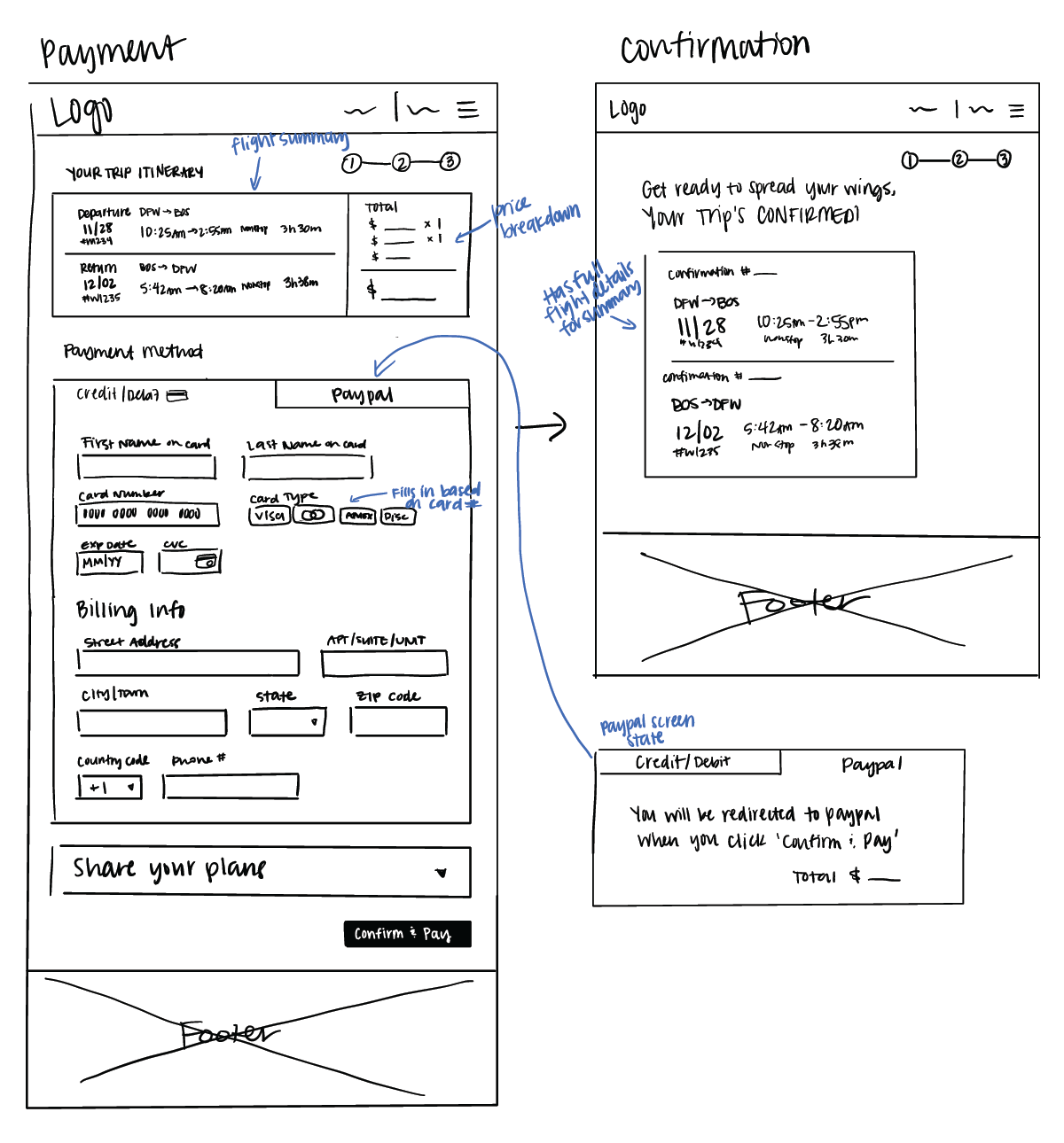
Sketch
To build upon the flow diagram, it was time to draw the screen layouts laid out in the flow. This helped get an idea of where elements would go and let me easily pivot if something wasn't quite working in the design.
4. Deliver
Prototype
Using the sketches from the previous step, I built out the design in Figma. I added more details and interactions to make it as close to the real thing as possible.
Annotations
After conducting a few informal usability tests, the design would be ready to be passed onto development. In order to do so, annotations were added by using the comments function on Figma, specifically describing interactions and what happens when errors occur, to make the design as clear as possible for developers.